
Hi guys!
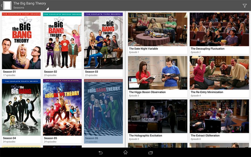
I’ve mentioned an upcoming TV show revamp quite a few times now, and I’ve been working a fair bit on it recently. I thought I’d show you a few screenshots of what it looks like at the moment.
The first screenshot is on a tablet in landscape mode. It’ll show a grid of seasons on the left and a grid (or list) of episodes on the right. You’ll also be able to long-press seasons to mark all as watched or unwatched - or even remove them. It naturally allows for multiple selections as well. Also, it naturally works with the dark theme as well.
There’s been a few other changes, as you’ll see soon, but one of the areas that really needed some help was the landscape layout on phones. It sucked quite a bit. Here’s a comparison of the old layout and the new one.
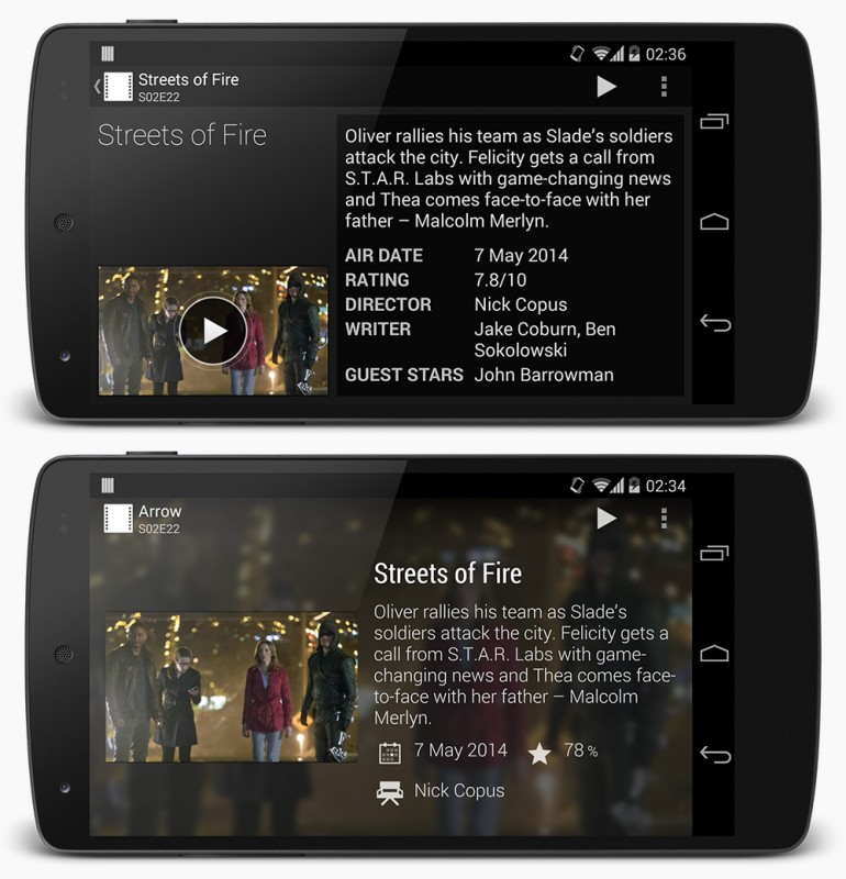
Note that the action bar didn’t quite look like that in the old version. It’s different due to some changes I made in the new design.
So… What do you think? Much needed changes, if you ask me.

Great improvement… Especially for the phone in landscape. It’s really great that you’re always improving this already excellent app… although I still wish you’d bring out a windows 8 version! 😉
Looking great so far. Thumbs up from me.
The phone in landscape screenshot looks ridiculously amazing. Great stuff!!